When lots of colour is calling!
Turns out not everything can be letterpressed printed, as much as I would love that, but it ALSO turns out that other forms of printing can still cause trouble especially when you’re used to full control over the end colour.
I am forever grateful to be a designer who is absorbed in printing. Learning from experienced litho-printers, understanding the way ink can come out, the effect that paperstock can have on colours, even spot colours, how foil sits on digital printing versus litho, these are all things I see everyday and continue to learn about during all my projects.
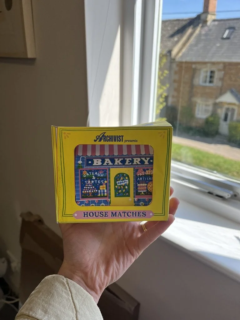
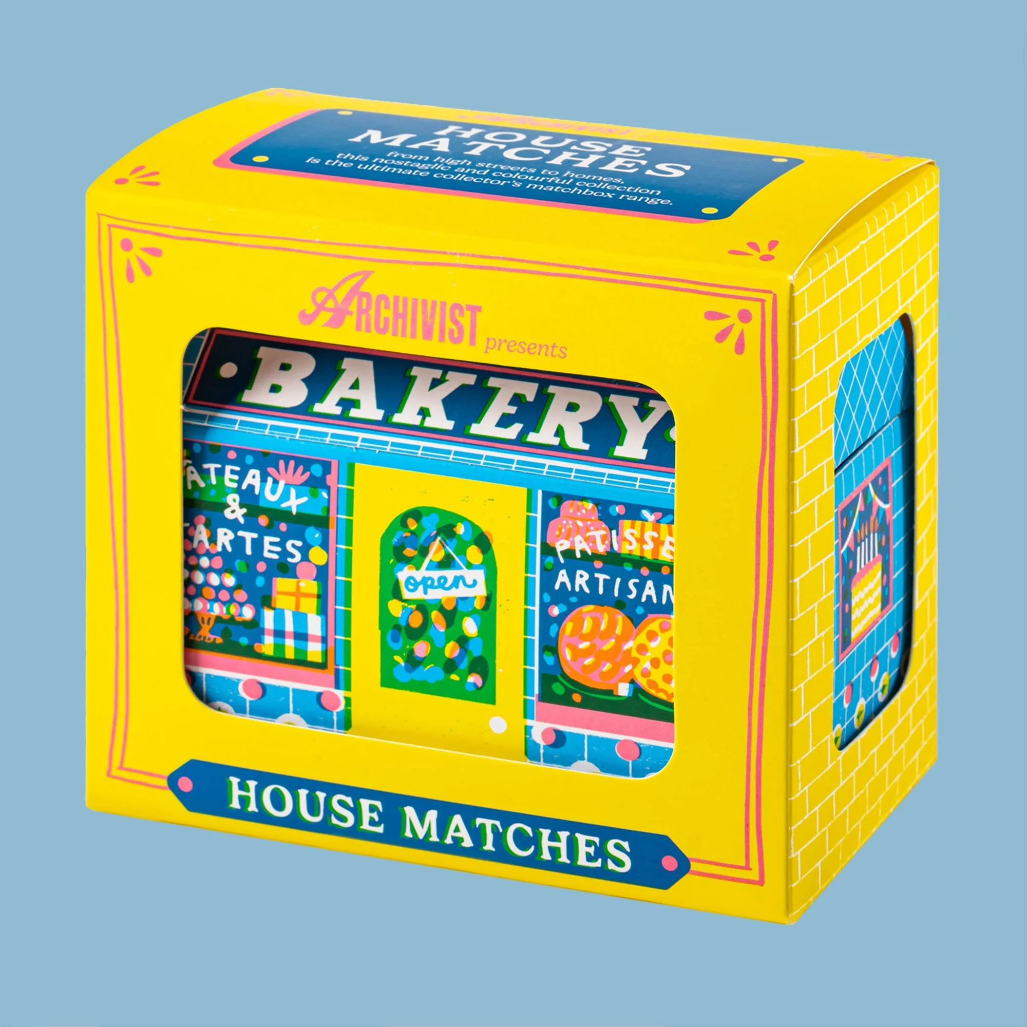
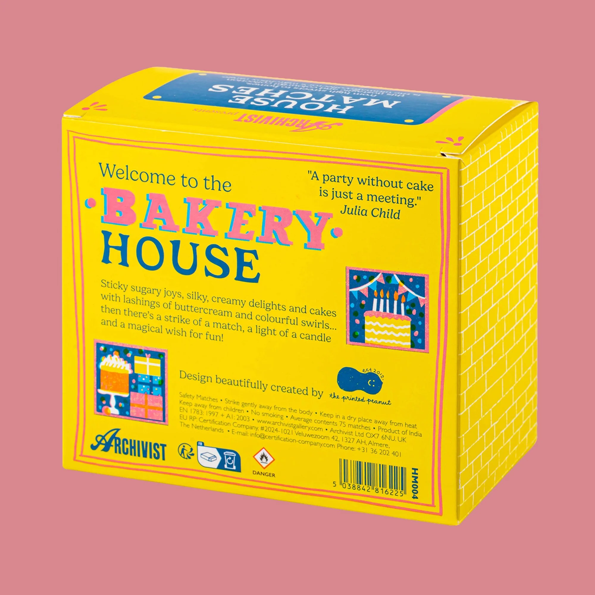
2025 saw two big projects that saw me spending three days in India to work with an incredible print department there. From concepting with artists, to creating cutter guides, finalising artwork and working to the paper, print and finishing specifications, working so closely with a team as hardworking as the team in India was a true privilege. Long hours and meticulous design decisions were made, but the end result for both the Print and House Matches project was colourful, fun and made to a high standard. You can read more about the project as a whole in my Art Direction section.
Created and brought to market for Archivist under my role as Head of Design (I even did all the editorial for the packaging!).
www.archivistgallery.com
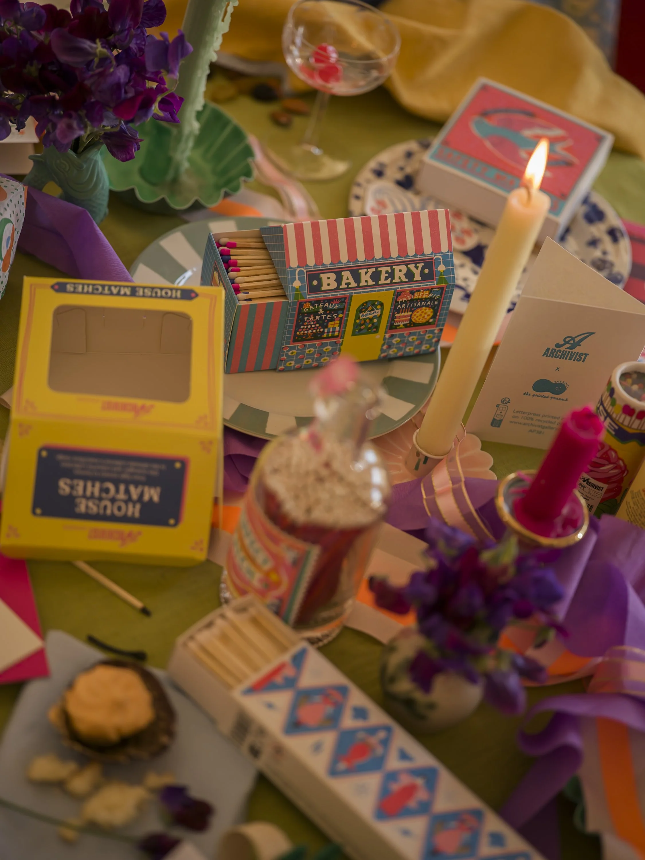
Lifestyle photography by Sarah Frances Kelley.
Artist work by The Printed Peanut, @theprintedpeanut,
and Ariane Butto, @ariane_butto.
Skills
Packaging
Typography
Design
Print
Colour Selection
Art Direction & Marketing
Role
Designer | Art Director
Year
04/2025
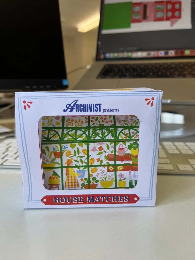
What started as a box to protect the product during shipping quickly went from a simple white box to a colourful design that was an extension of the matchbox inside it.